BetterSleep Homepage Redesign
Role: UI/UX Designer
Internship Project at BetterSleep
Guide by: Anissa Lamrani-Amine (Senior Product Designer)
Duration: 3 weeks
This mini UX project was done during my internship at BetterSleep. The goal is to enhance the overall engagement rate of the BetterSleep app's homepage, enabling new users to find the right content more quickly, feel more guided, and engage more consistently, ultimately improving activation and early retention.
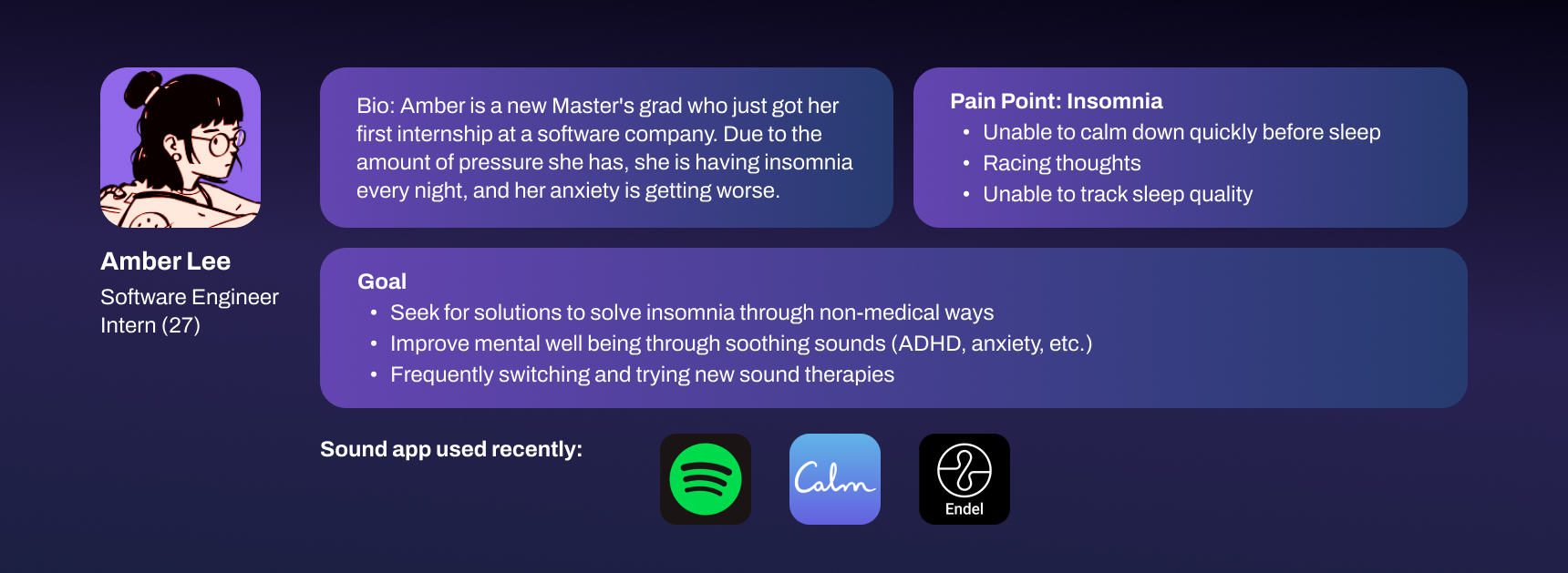
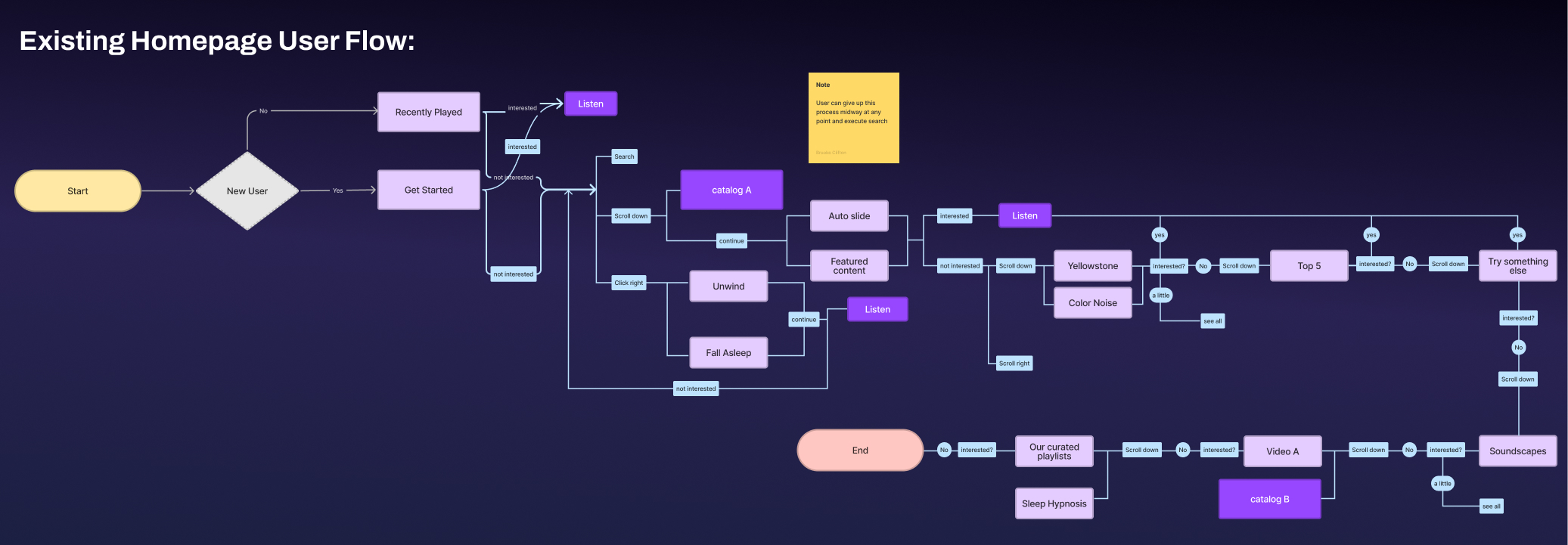
Problem
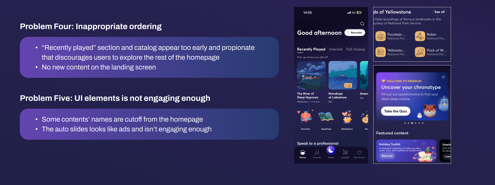
Based on the existing in-app research and users feedback, the main 3 issues are highlighted:
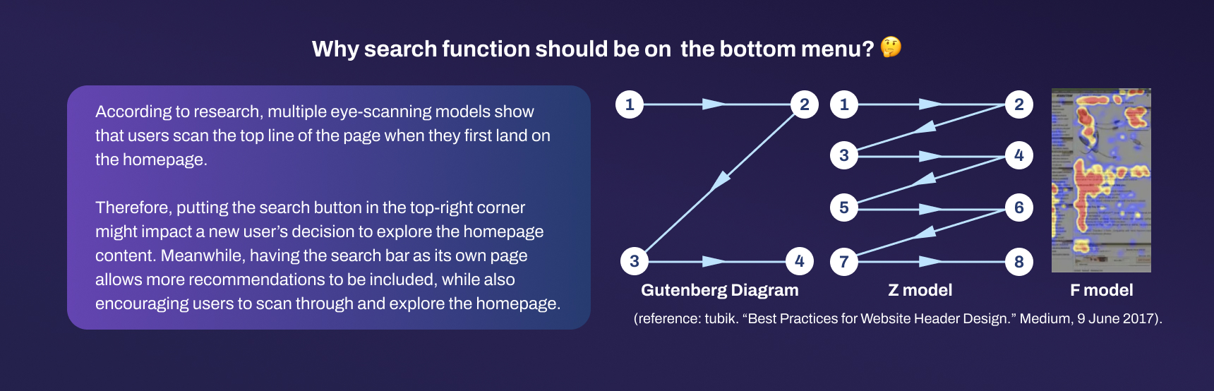
- Low engagement rate: users choose to search directly instead of exploring the homepage contents
- Inefficient engagement: users only click on the first carousel, and lose interest for the rest
- Unclear guide: new users do not understand content categories.
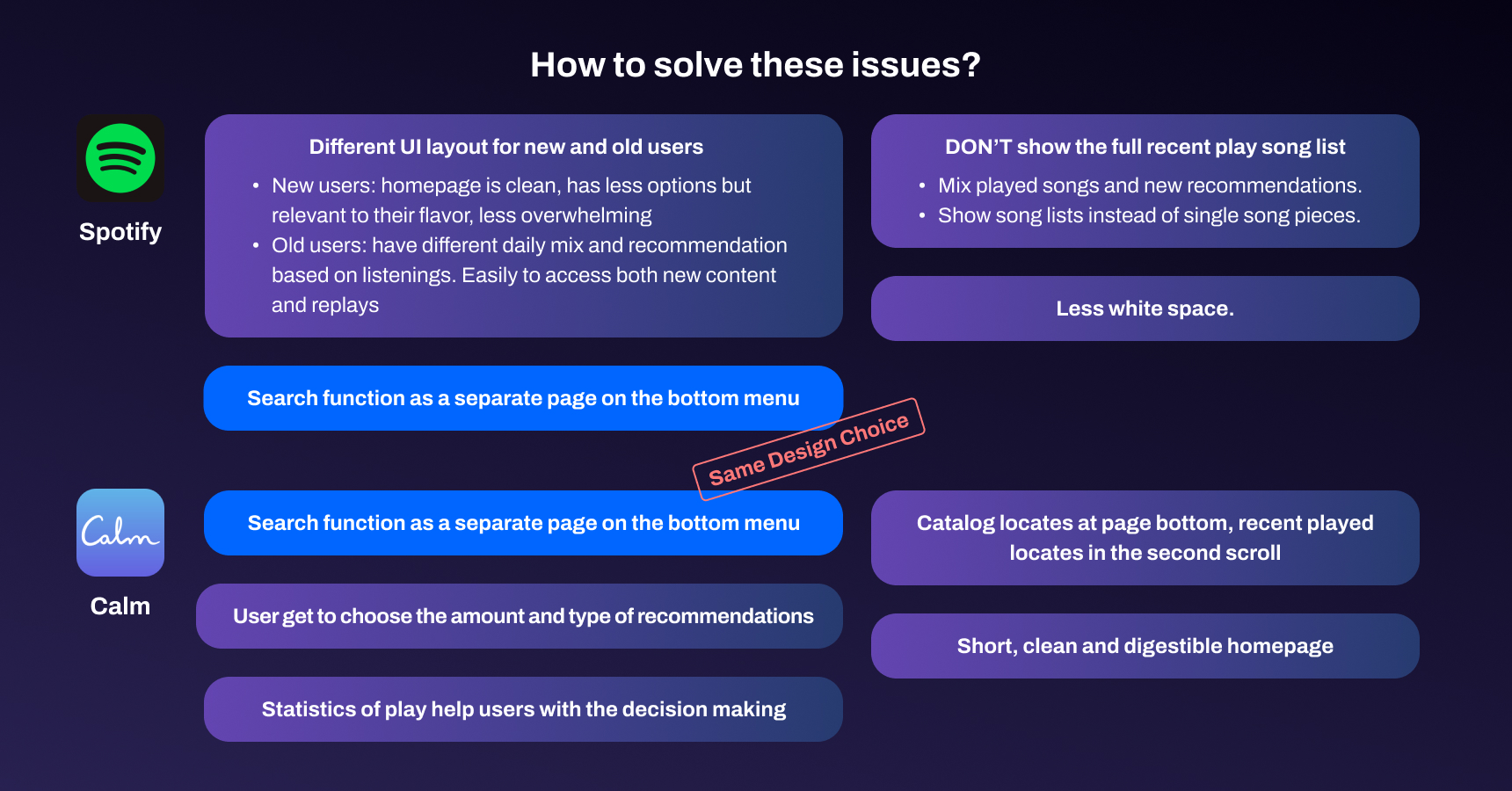
Benchmark
Aiming to solve the issues that were discovered in the previous stage, we start to look for potential solutions through other sound apps.
Solution
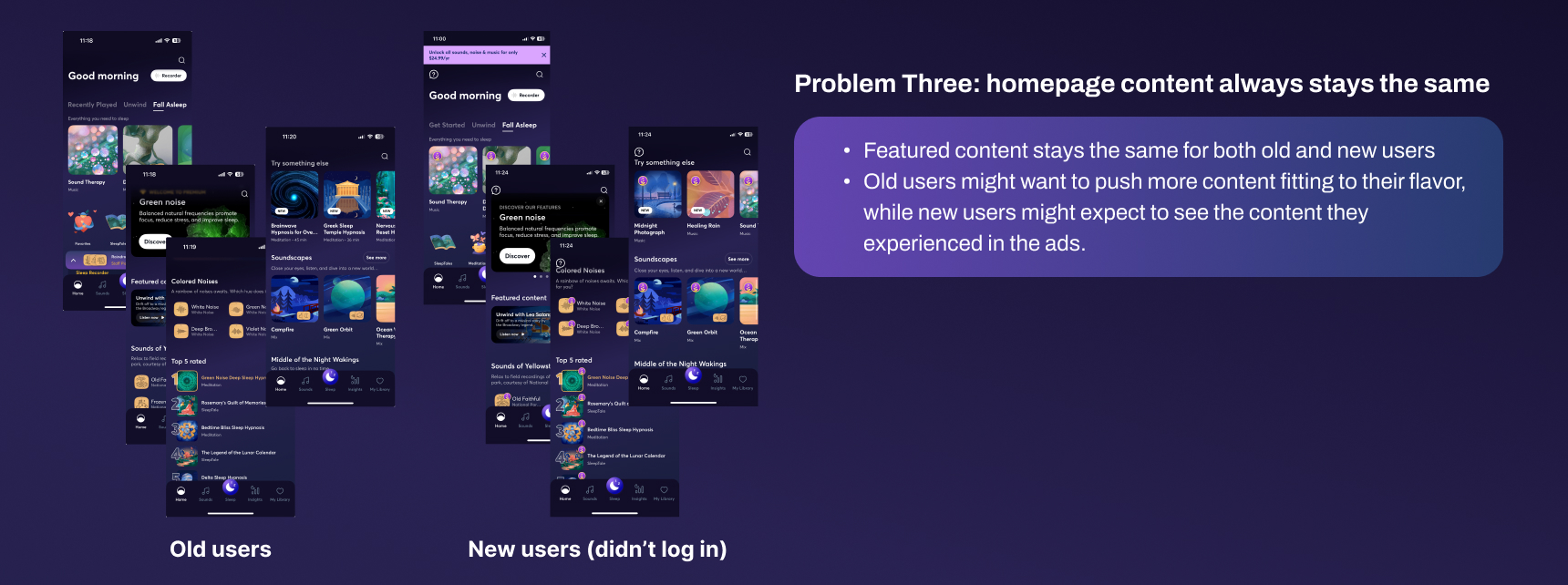
More customized, predictable and frequently renewal homepage content
- Recommend Daily new content for all users
- Mix “recent play” on homepage with other recommendation, change the section name to something like “Recent sleep rotate”
- Recommend content based on the onboarding test for the new users OR past listening for the old users
Layout encourages both new and old user to explore and engage with the homepage
- Recommend customized content for users on top of the homepage
- Show how many users played on each content
- Show catalog and recent played at the bottom
- Have a show video option for some UA winning video content that new users might interest to see. (ex: rain, green noise, sound therapy)
- Redesign autoslides to make user more engaged
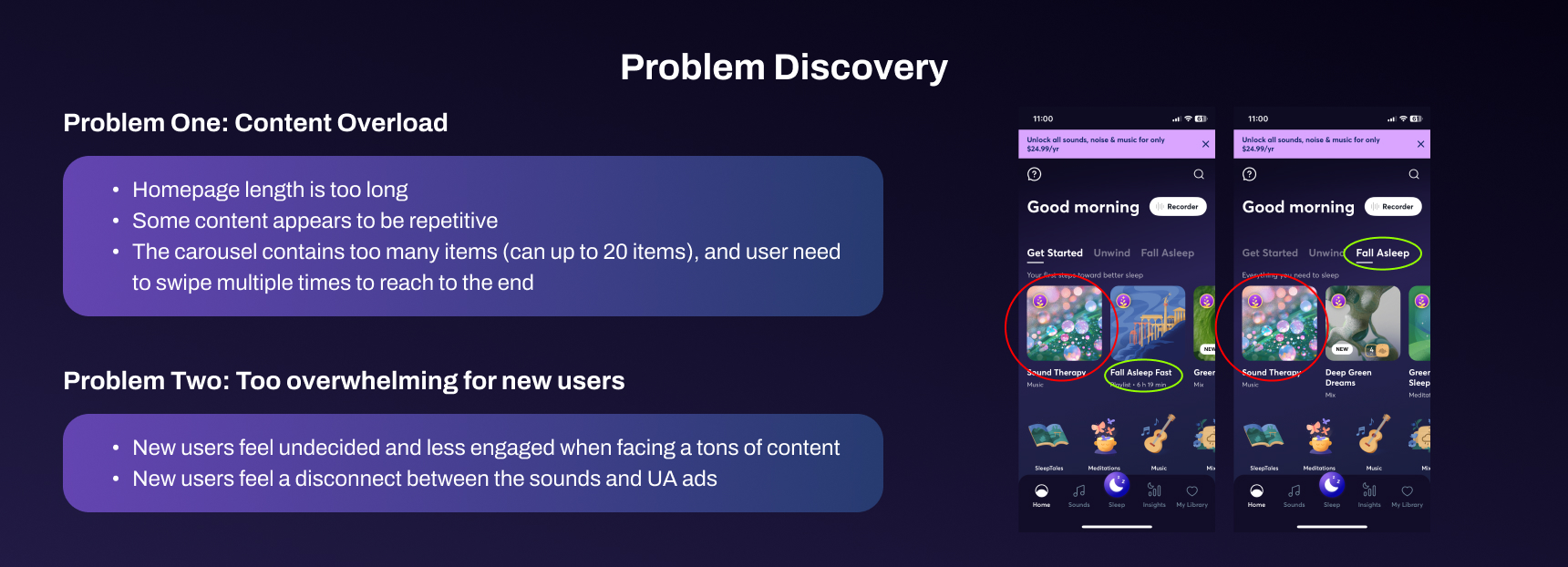
A more digestible, clear and customized homepage structure & layout
- Less than 5 items in each row
- Change the UI, making each image smaller
- Shorten the homepage length to 3-4 scrolls
- Allow user view homepage recommendations by certain theme, and decide the amounts by themselves
Option A
Shorter homepage, more customized content driven based on users’ preference

Option B
Focus more on letting users get accessing more new content

Video View
Connect the popular UA ad visuals with sounds in app

Final Design
- Combine option A & B, a shorter homepage while also encourage content exploration by users’ wishes
- Less focus on point to point interaction, like search, past played histories
- Allow users watch videos with the sound, and minimize the view to explore the homepage while playing.

Key takeaways
Too much choices equal to no choice. To encourage users engage with the new content, the choices provided should be limited but also targeted. Moreover, new users expect to see what they saw in the advertisement, or something similar. To bridge this gap, we must align the onboarding experience with our marketing promise, ensuring a seamless transition that builds trust from the very first tap.